Showing posts with label interior design. Show all posts

Sunday, September 15, 2013

The McOlson House: Design Boards

Yesterday was a fun day! Karli delivered Marie and Travis the design boards we put together for their main living areas. This included the front room/dining room, the kitchen space and the family room. Below you can see each room's design board with notes for the two fo them as they start to execute the plan.

While Karli was there, the placement of the furniture in the front room was adjusted and Marie sent me a message today saying that she's going to buy the paint right now.

Here's the front room design. The walls will be SW Accessible Beige and the ceilings will be white.

Marie's front room


A view of the room
 
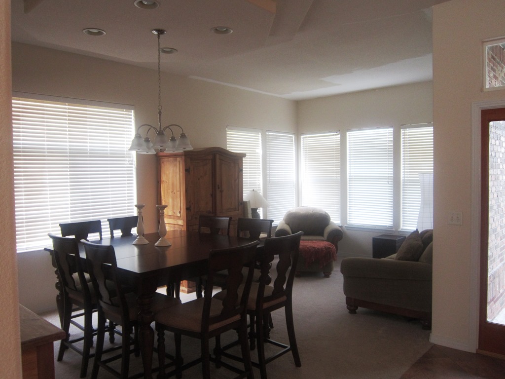
The front room and dining room are open to one another, so they all need to be the same paint color. We also wanted to repeat the mustard/yellow accent by painting their side board and then hang that "inspiration piece" above. You will see that piece right as you walk in the house, so all the accent colors have been chosen to play off that.

The dining room view
 
 
Marie's Dining Room


Next up is the kitchen. They shared the floors they've chosen for the entry, kitchen and family room and we must have guessed correctly, because something very similar is represented below. We talked about painting their island SW Tricorn Black as shown below. Then potentially dropping three pendants. The eat-in kitchen will get a new light too. This whole space and the adjacent family room will be SW Functional Gray.

Kitchen view

Marie's kitchen


And finally, the room that presented the more challenging aspects of the entire project. The room is large and expansive. It also has a large wall that is calling for some art. The location of the TV required some creative thinking.
Family room view


So we've proposed two large square canvases hung vertically above the black console to draw the eye up. We also suggested adding a small bookcase under the TV, near to the stair railing to "ground" the TV. It should be painted the same color as the walls for balance.

We left lots of options for patterened curtains and rugs. We wanted them to be able to choose their favorite within their budget and timeframe. Their existing furniture will work in the room (rearraged ever so slightly) with potential additions of a chair (in an accent color like teal) and some transitional seating like poufs or cubes.

We also suggested that they paint the inset where the clock hangs over the fireplace a green. It will balance the two green canvases hung on the adjacent wall.  

Marie's family room


We really enjoyed putting these boards together and can't wait to see how it all comes together.

Kandy and Karli

Saturday, September 7, 2013

The McOlson House: Making It Their Own

Meet Marie.

I was honored to have Marie as a beautiful bridesmaid during my wedding

I met her our freshman year of college. We were on the same floor in the dorms and soon decided we'd like to share off-campus housing once we were allowed to move out. We lived together for two years, in a tiny apartment and a rented single family house, so I had a pretty good idea about her style. She's one of those friends that you can pick right back up with, even if it's been months since you last talked.   

Marie and her husband Travis recently bought a house. She asked me to come over and give them some ideas on paint colors, layout, finishing touches, etc. I jumped at the chance! I spent a morning with the two of them, talking about pieces of furniture they had to keep, what we could change, what they like and don't like. Then I took pictures and measurements and started planning with mom. We did a lot of our brainstorming via a secret board on Pinterest. (Have you tried that? It's amazing!)

So here are the before photos of the space. Their biggest concern was the paint. The pale yellow is so not them. They want to add color, but aren't sure where or how much. So my goal is to add punches of color within a neutral palate.

As you walk in the front door, this room is on your right. It's a dining room/formal sitting room. You can see that they started to paint the ceiling white, but it made the yellow-ish paint look worse. So right now that's on hold until we pick a paint color.
 
This is the couch (with a matching chair) in the front room. We'll work with this, just switching up the placement and pillows.
 
This is the dining room view. The table is cocktail height. The light fixture is change-able as well.
 
The next room you walk into is the open, spacious kitchen. The granite color is great. They don't love the tile floor or backsplash, so I'll come up with some ideas for that as well.
 
From the kitchen you can see into the family room, where they spend the majority of their time. We'll work with all the furniture in here. Paint, window treatments and some punches of color will finish this off nicely.
 
This is a piece of art Marie recently bought. I am actually using it as my inspiration for the pops of color I'll use in the entire space. I'm thinking of hanging it on a wall you see right when you walk in--a point of view where you can see all the rooms. It will all make sense from that vantage point.
 

Mom and I were putting finishing touches on our design boards this weekend. I'll present them to Marie and Travis and get their feedback so we can make any adjustments before they're considered final.

This is SO fun!

Stay tuned for more,
Karli

Friday, July 12, 2013

The Power of White Paint

We were just having a conversation this afternoon about how many white interior paint schemes we've been seeing. The perfect crisp white paint looks clean and serene. And the immediate bonus: any color you choose to use in that room will automatically pop.

Here are some of the examples we've found on Pinterest lately. (Consider following Karli or Kandy on Pinterest to see what's inspiring us.)


Because the wall is white, the headboard almost creates a "frame" for the bedding. Even though the rug, furniture and bedding are dark colors, the room still feels bright! Source

This living room feels comfortable and cozy, yet fresh and clean. Those windows are amazing, right? Source

Sensing a common denominator here? Blue seems to go so well with crisp white. Colors in nature! Also notice how the artwork and frames just bounce off the wall. What a great way to make the pictures and artwork you've chosen really shine!  Source
This is actually from a blog Karli started following for hair inspiration. The jewelry display draws the eye in. You notice every detail like its in high def. Look at the sequins on that pillow. Source

Wow. So simple, yet so impactful. There is actually very little going on here, but each item is bold against the white background. (Those black doors keep showing up!) Source

Hopefully this has inspired you to consider a bright, clean white as one of your next "colors" in a room.

~Kandy and Karli

Monday, June 24, 2013

Hotel Sax Chicago: Design Inspirations

This week I traveled to Chicago for a recipe photoshoot with work. I decided to stay at a different hotel in River North. I found Hotel Sax online and was impressed with the location, rate and reviews. So off I went.

It is located right next to House of Blues off State Street and Kinzie within walking distance to lots of great Chicago steakhouses like Harry Carey's as well as some hip new resaurants like RMP and Sable Kitchen + Bar. (I ate at the last two. Did not disappoint!)

The reception area was the first unique element I noticed. The antique glass display cases were filled with cut crystal glassware. It was not the normal sterile greeting!

 
The halls on the way to my room featured graphic pewter carpet, metallic tone-on-tone wallpaper and dark wood trim. A sort of rock 'n roll vibe...
Loving the patterns, metallics and darker tones.
And so the wallpaper continues...

In my room I was greeted with a variety of textures, patterns and tones. A snake skin chair, an embossed leather headboard, plush black and white carpet, crisp white linens and wood grain furniture. (All of this with a lack of "artwork." I love how this design lets the colors and textures be the focal points instead of a large picture over the bed, for instance.)
LOVE that wallpaper. Very subtle but gives some interest to the wall.
An up-close of the wallpaper in the bedroom


This cool sidetable has a glass top with purple marbles inside. I also love the mirror behind the side lamp. Again, it doubles the amount of light and makes the space feel big.

In the bathroom, the lime green grasscloth wallpaper really set off the black and white tile and fixtures. 
Modern with a nod to retro


I love that this wallpaper makes you want to touch it!
After using the bedroom and bathroom for a few days I think there are a few things I want to tuck away in my own "inspirations" for our future master bathroom remodel and a couple updates in our master...

Larger white subway tiles.
Again, a modern bit of retro.

Black and white floors (I love these but I think I might get tired of them in real life)
So much fun
These were actaully small tiles laid in a square 4x4 pattern

I love their tasteful use of mirrors (because we all know there is a fine line between 70's creepy floor-to-ceiling mirrors and framed modern mirror features)...
This is opposite the large windows so it bounces light around and makes the room feel much bigger than it is.
Our master bedroom is big enough to have a small seating area. I love the idea of one soft chair and lamp.
Notice that this lamp base is painted a dark purple.

So if you can't already tell, I'd recommend this place if you're headed to Chicago and you like a posh, modern, rock 'n roll style.

Feeling inspired,
Karli

Thursday, January 17, 2013

Karli's Guest Bathroom Makeover

I posted about getting new windows earlier and I'm already loving the efficiency and warmth (along with the crisp white vinyl) they're providing. But on to the dilemma they also present...


When we decided to replace the window in the guest bath shower, we knew that would mean that the tiles would be impacted. Here's a look at the bathroom from the previous owner...


Not much was necessary right when we moved in since everything was in fairly good condition. (Don't get me wrong, there are things I really despise about the room--like the countertop/sink combo, the builder grade mirror and lights and the ugly old medicine cabinet--but its completely functional.) So basically all that had been done was a fresh coat of white paint and hardware on the cabinet, a new white shower curtain, new cozy khaki runner and some countertop accessories.

In this picture you can see the room without all the accessories I just mentioned. A blank slate for the most part. Oh I almost forgot about the lovely towel bars, which you can see here too.

Here's the current shower tile, complete with special markings from previous little artists.


And the shower/bath fixtures--I'm sure many of you have or previously had beauties like these!


Here's the mirror/light/medicine cabinet area that I dislike so much.


And my real excuse for starting this project now...the damage created when the new window went in.


Here are some of my inspirations for the space.


I've decided on white subway tile, but I'm going to use a light gray grout. White grout is hard to keep clean and the gray grout will provide a nice bit of contrast to a fairly white room.  I'm leaving the tub as is (cost)....and it's in good shape but I'm going to tile all the way up to the ceiling around it.

Eventually I'll get to the mirror, light fixture and medicine cabinet area.

What do you think of white tile with darker grout? I'm loving it!

~Karli

Friday, January 11, 2013

Karli's Home Office Inspiration Board

As we were finishing up the last bit of flooring in the office, I put this inspiration board together. We have a similar rug already as well as the table, desk chairs and the desk accessories. I had a small side table, very similar to the one below, that I already spray painted teal.

I can't seem to find anywhere to source the curtains I have in my mind, but these are close. I may just have to make them or order them from someone on etsy. I'll post about the finished product (soon, I hope!)

~Karli