Showing posts with label mirror. Show all posts

Saturday, March 12, 2016

Master Bathroom Reveal

Today I'm sharing pictures of our master bathroom remodel! Back in February, our contractor called me and told me that they'd like to use our space in an ad they're placing in a local magazine!


If you remember back to my posts from last year, you'll know we left off with a room that was stripped down to the studs. The project went quickly after my last update, but then life got in the way of me updating you here on the blog. (If you follow me on Instagram, you've probably seen many recent photos though!)

Now, the perfectionist in me is still saying, "Karli, you haven't found that perfect piece of found art to hang above the toilet" and "Those lovely barn doors aren't hung yet!" But those finishing touches will come very soon. For the time being, this beauty was ready for her photoshoot. Literally.

We found the perfect vanity at Restoration Hardware. I love the thick marble top! When I touch it and my fingers feel the velvety smooth texture, I swoon.

I knew I wanted two narrow, vintage looking mirrors above the vanity. I found two great beveled-edge pieces from Pottery Barn. I love their vintage look.

And the perfect wall sconces were found while I was browsing a Shades of Light catalog. Now, you may be wondering why I went with oil rubbed bronze for the lights. Yes, I purposely mixed finishes in this bathroom. It will make more sense in the next photos. :)


For the tub, this is where I spent hours and hours researching the perfect fit. Literally, we could not fit a tub in this space if it was one more inch wide. I found the narrowest slipper tub on the market. Trust me, I searched high and low. We have a narrow bathroom but I was bound and determined to get my tub!! We went with an acrylic tub that's been designed to look like a vintage cast iron. And that tub filler--it shines in all its glory!


Because I wanted the eye to move around the room, focusing on different spots, I opted for the black law feet with this tub. In fact, you'll start to notice a few more black and/or oil rubbed bronze items now that I've pointed it out. I wanted a collected look. Something that looked almost like a vintage farmhouse bathroom--with a slightly glamourous touch.


I knew I wanted to use marble hex in the bathroom somewhere. I actually thought I wanted the shower basin to be marble, but I am SO happy our contractor advised us otherwise. The solid surface basin they installed blends perfectly and is a breeze to clean! But I still got a gorgeous strip of the marble up the middle of the shower where the gleaming fixtures are mounted.


We couldn't be happier with how this bathroom turned out. We loved our contractor and would recommend them to anyone looking to embark on a bathroom renovation. They only do bathrooms, so they can be a trusted expert for you. And they met my perfectionist standards---that's no small feat.

Here are some of the images they shot. You can currently see our bathroom on Houzz.com and CondonContracting.com.


Courtesy of Condon Contracting
 

Courtesy of Condon Contracting


Courtesy of Condon Contracting
 
I hope you've enjoyed looking around our master bathroom!

Karli

Sunday, September 15, 2013

The McOlson House: Design Boards

Yesterday was a fun day! Karli delivered Marie and Travis the design boards we put together for their main living areas. This included the front room/dining room, the kitchen space and the family room. Below you can see each room's design board with notes for the two fo them as they start to execute the plan.

While Karli was there, the placement of the furniture in the front room was adjusted and Marie sent me a message today saying that she's going to buy the paint right now.

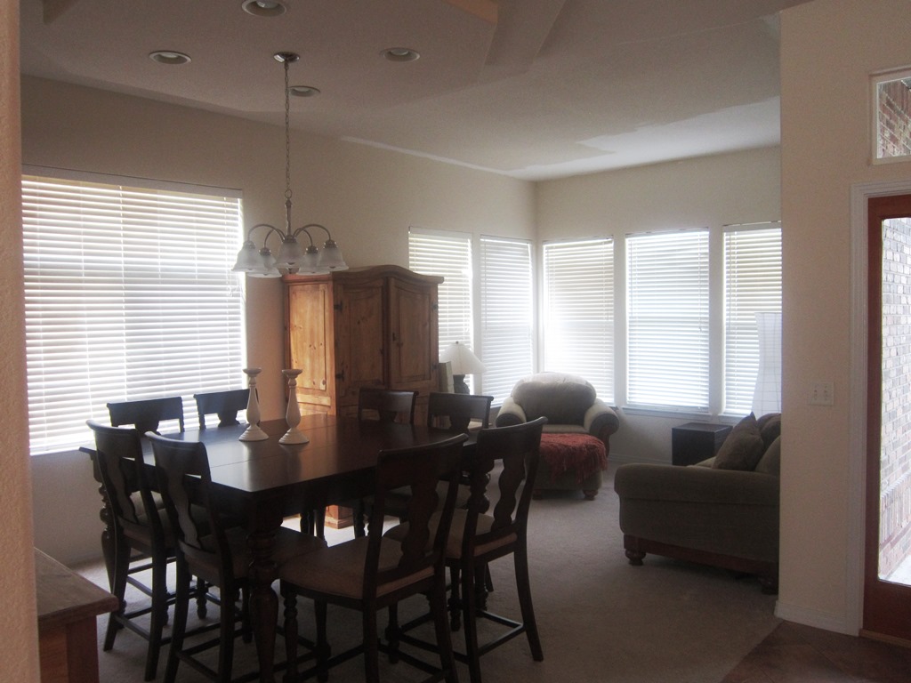
Here's the front room design. The walls will be SW Accessible Beige and the ceilings will be white.

Marie's front room


A view of the room
 
The front room and dining room are open to one another, so they all need to be the same paint color. We also wanted to repeat the mustard/yellow accent by painting their side board and then hang that "inspiration piece" above. You will see that piece right as you walk in the house, so all the accent colors have been chosen to play off that.

The dining room view
 
 
Marie's Dining Room


Next up is the kitchen. They shared the floors they've chosen for the entry, kitchen and family room and we must have guessed correctly, because something very similar is represented below. We talked about painting their island SW Tricorn Black as shown below. Then potentially dropping three pendants. The eat-in kitchen will get a new light too. This whole space and the adjacent family room will be SW Functional Gray.

Kitchen view

Marie's kitchen


And finally, the room that presented the more challenging aspects of the entire project. The room is large and expansive. It also has a large wall that is calling for some art. The location of the TV required some creative thinking.
Family room view


So we've proposed two large square canvases hung vertically above the black console to draw the eye up. We also suggested adding a small bookcase under the TV, near to the stair railing to "ground" the TV. It should be painted the same color as the walls for balance.

We left lots of options for patterened curtains and rugs. We wanted them to be able to choose their favorite within their budget and timeframe. Their existing furniture will work in the room (rearraged ever so slightly) with potential additions of a chair (in an accent color like teal) and some transitional seating like poufs or cubes.

We also suggested that they paint the inset where the clock hangs over the fireplace a green. It will balance the two green canvases hung on the adjacent wall.  

Marie's family room


We really enjoyed putting these boards together and can't wait to see how it all comes together.

Kandy and Karli

Friday, June 28, 2013

Quick Change Artist: Master Bedroom Refresh

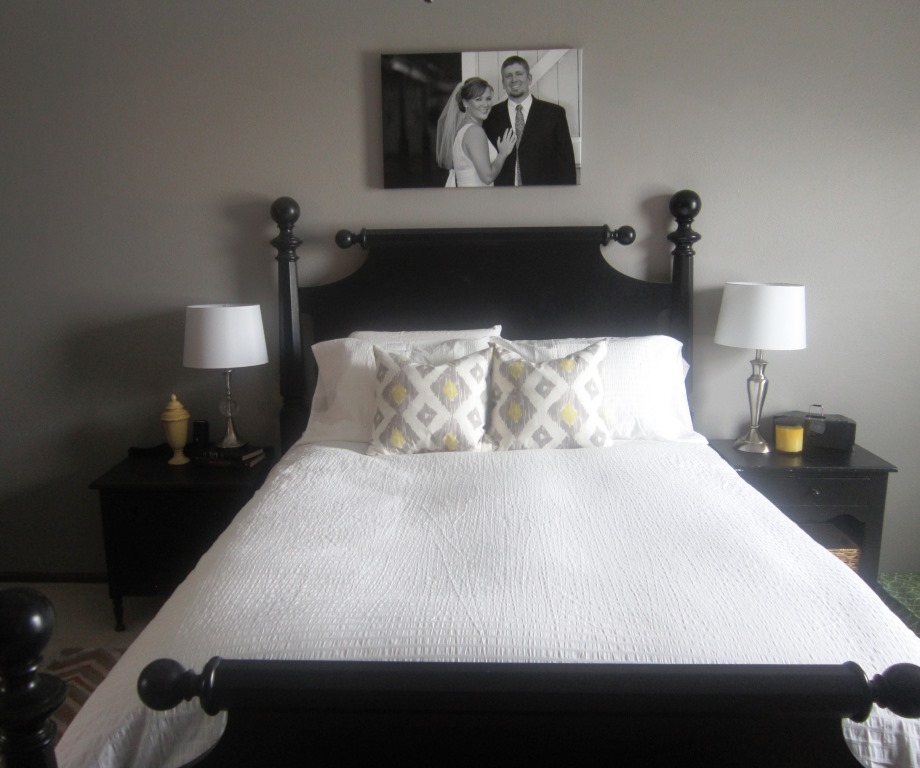
Our house has a lot of gray, black, white and green. Brent has voiced this to me on several occasions. So after giving it some thought, I realized one of the easiest rooms to update would be our master bedroom. It had green pillows and a green candle. That's really all the green. Here's a glimpse of what it looked like.
Two green pillows and a black and white damask pillow.
 
I've been thinking about adding more white to the bedding.
 
Even Porter's bed is green. (Cutest doggie ever, right?!)
 
The wall opposite the bed. I happen to really love this arrangement.
In an ideal world, we'd have a nice sitting chair over in that corner with a side table and a floor lamp. And you probably can't tell from the pic above but there is a painting hanging in the mix that I've always loved. I bought it from an artist outside the Guggenheim about five years ago. So it became my inspiration.
What do you see in the painting? I see a street view of a New York with a taxi on the left.
I had a glorious Friday off and I headed to TJ Maxx for some stress relief. I hit the jackpot in the clothing department (scored black shorts and two versatile tanks) and the home goods (pillows, a basket and a white ceramic garden stool I've been hunting for a year!)

I got these two pillows as a starting point. Love that they pull in the yellow from the painting.
 

I had the rug in the guest room and pulled it in for fun. I think I like it!
 
Also found a yellow candle that smells like apricots (yum!) and the basket that fits perfectly in Brent's night stand.
I think I can amp up the yellow just a little bit more, so I'll be on the search for a new throw for the bench/bottom of the bed.
I remembered that I had two shams that came with the duvet cover so I put two extra pillows in them.
 
I also found that cool ceramic white light that I added to the dresser.
I'm loving the results for only about $45! Thank you, TJ Maxx!

~Karli

Monday, June 24, 2013

Hotel Sax Chicago: Design Inspirations

This week I traveled to Chicago for a recipe photoshoot with work. I decided to stay at a different hotel in River North. I found Hotel Sax online and was impressed with the location, rate and reviews. So off I went.

It is located right next to House of Blues off State Street and Kinzie within walking distance to lots of great Chicago steakhouses like Harry Carey's as well as some hip new resaurants like RMP and Sable Kitchen + Bar. (I ate at the last two. Did not disappoint!)

The reception area was the first unique element I noticed. The antique glass display cases were filled with cut crystal glassware. It was not the normal sterile greeting!

 
The halls on the way to my room featured graphic pewter carpet, metallic tone-on-tone wallpaper and dark wood trim. A sort of rock 'n roll vibe...
Loving the patterns, metallics and darker tones.
And so the wallpaper continues...

In my room I was greeted with a variety of textures, patterns and tones. A snake skin chair, an embossed leather headboard, plush black and white carpet, crisp white linens and wood grain furniture. (All of this with a lack of "artwork." I love how this design lets the colors and textures be the focal points instead of a large picture over the bed, for instance.)
LOVE that wallpaper. Very subtle but gives some interest to the wall.
An up-close of the wallpaper in the bedroom


This cool sidetable has a glass top with purple marbles inside. I also love the mirror behind the side lamp. Again, it doubles the amount of light and makes the space feel big.

In the bathroom, the lime green grasscloth wallpaper really set off the black and white tile and fixtures. 
Modern with a nod to retro


I love that this wallpaper makes you want to touch it!
After using the bedroom and bathroom for a few days I think there are a few things I want to tuck away in my own "inspirations" for our future master bathroom remodel and a couple updates in our master...

Larger white subway tiles.
Again, a modern bit of retro.

Black and white floors (I love these but I think I might get tired of them in real life)
So much fun
These were actaully small tiles laid in a square 4x4 pattern

I love their tasteful use of mirrors (because we all know there is a fine line between 70's creepy floor-to-ceiling mirrors and framed modern mirror features)...
This is opposite the large windows so it bounces light around and makes the room feel much bigger than it is.
Our master bedroom is big enough to have a small seating area. I love the idea of one soft chair and lamp.
Notice that this lamp base is painted a dark purple.

So if you can't already tell, I'd recommend this place if you're headed to Chicago and you like a posh, modern, rock 'n roll style.

Feeling inspired,
Karli

Sunday, March 10, 2013

A New Old Door for Karli's House

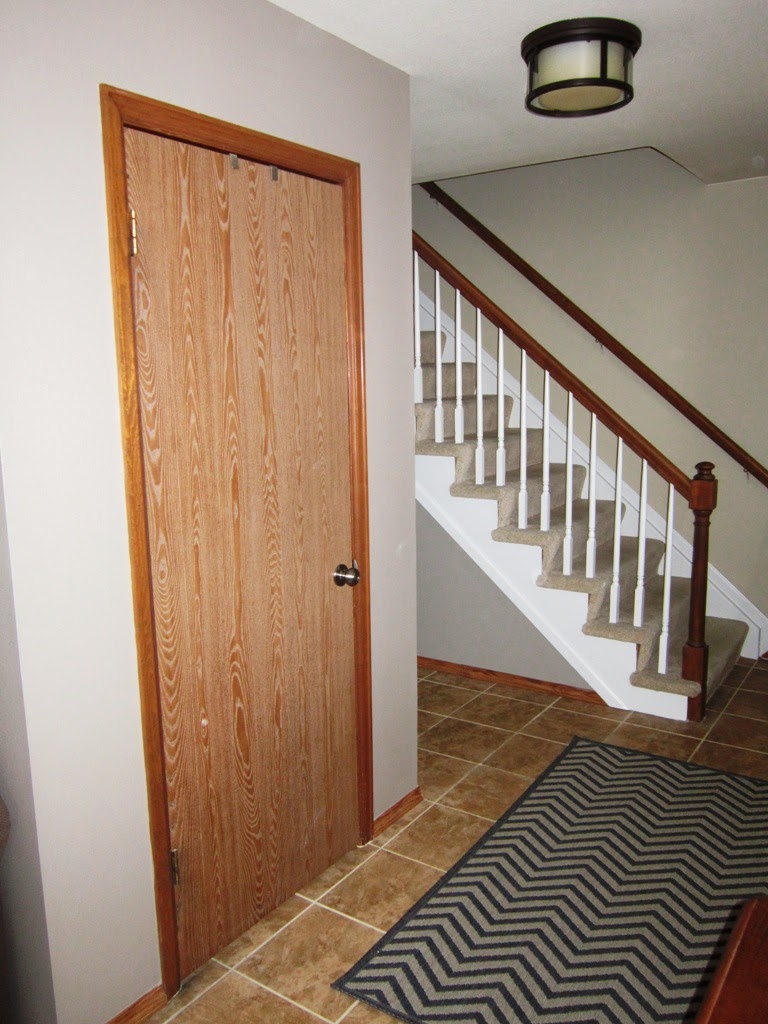
Karli has an entry closet just as you walk into her home. She has had several ideas for making over that area but because she's working on basically every room in their house, she hadn't gotten around to the door yet. 

Here it is...you can see it even took a blow on move-in day...

A close up of the damage
I found a great vintage door at a garage sale several years ago and it has resided in my garage ever since, just waiting for its purpose. I loved all the glass panes and it was already painted black. In one of Karli and my conversations, we discussed perhaps using it at her house. After measuring, we decided it came "close" to fitting. It was only 2 inches too short...that shouldn't be a problem, right?

Karli's Daddy helped with the project. We cut a 2x4 (a board that measures 2 inches in depth and 4 inches in height) to the same width as the door...29 3/4 inches. We cut off the top of it using the radial arm saw, squaring it up to fit the bottom of the door. We then glued it and clamped it to the bottom of the door.


We knew the door was now too long but we wanted to actually cut it off after we got to Karli's house. You know the old saying, measure twice, cut once. Well, that's what we did. Measurements taken over the phone can vary!!!

After the glue was dry, I lightly sanded the door and primed the new board on the bottom. Then we were ready to transport it to Karli's house along with the circular saw, tools and clamps.

When we got to Karli's we removed her old door and sized it up next to the vintage replacement. 
The vintage door is under Karli's closet door for the size-up

We got so lucky...the hinges lined up. The door knob catch was slightly off but we quickly fixed that with a wood chisel. We used the circular saw to cut 2 inches off of the board we had glued on to the bottom. We then drilled holes and reinforced that board with long wood screws. A test fit to make sure it was all a go...we used a small plane to shave off a little where it was rubbing. Then it was time for the fun stuff.

A test fit of the door with the additional piece on the bottom.

Shaving a little off
We could hardly wait to try out Krylon's Looking Glass Spray.We followed the advice from Pinterest and sprayed a mist of water on the glass before applying the Looking Glass. We put three light coats on the inside (or back) of the glass.

A good cleaning before we started spraying

This was just the first coat of Looking Glass, after the water spritz.
We were happy with the effect. It looked like old vintage mirror glass.

After that was dry, I cut squares of paper to lay on the glass, while I gave the back of the door two coats of black spray paint, Krylon Black Satin, followed by a coat of MinWax Semi-Gloss Polyurethane. We let that dry overnight, then turned the door over and repeated the paint process on the front. This time, we taped off the glass.


Finishing with Poly

An up-close of our taping and protecting

We could hardly wait until the next day when everything was dry. We attached the hinges and door knob and hung the "new old door." We were all thrilled with the results.
See another view of the before and after here.


~Kandy (and a little bit of Karli)