If you remember back to my posts from last year, you'll know we left off with a room that was stripped down to the studs. The project went quickly after my last update, but then life got in the way of me updating you here on the blog. (If you follow me on Instagram, you've probably seen many recent photos though!)
Now, the perfectionist in me is still saying, "Karli, you haven't found that perfect piece of found art to hang above the toilet" and "Those lovely barn doors aren't hung yet!" But those finishing touches will come very soon. For the time being, this beauty was ready for her photoshoot. Literally.
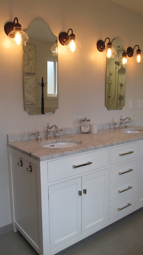
We found the perfect vanity at Restoration Hardware. I love the thick marble top! When I touch it and my fingers feel the velvety smooth texture, I swoon.
I knew I wanted two narrow, vintage looking mirrors above the vanity. I found two great beveled-edge pieces from Pottery Barn. I love their vintage look.
And the perfect wall sconces were found while I was browsing a Shades of Light catalog. Now, you may be wondering why I went with oil rubbed bronze for the lights. Yes, I purposely mixed finishes in this bathroom. It will make more sense in the next photos. :)
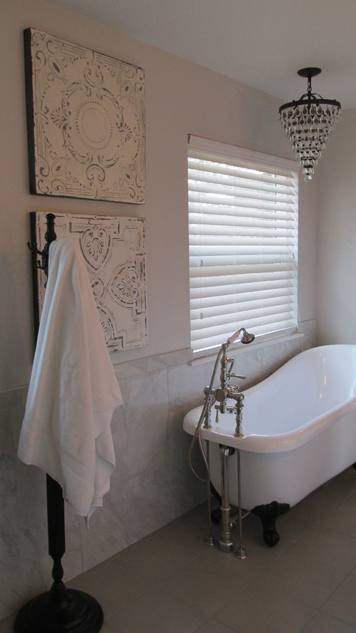
For the tub, this is where I spent hours and hours researching the perfect fit. Literally, we could not fit a tub in this space if it was one more inch wide. I found the narrowest slipper tub on the market. Trust me, I searched high and low. We have a narrow bathroom but I was bound and determined to get my tub!! We went with an acrylic tub that's been designed to look like a vintage cast iron. And that tub filler--it shines in all its glory!
Because I wanted the eye to move around the room, focusing on different spots, I opted for the black law feet with this tub. In fact, you'll start to notice a few more black and/or oil rubbed bronze items now that I've pointed it out. I wanted a collected look. Something that looked almost like a vintage farmhouse bathroom--with a slightly glamourous touch.
I knew I wanted to use marble hex in the bathroom somewhere. I actually thought I wanted the shower basin to be marble, but I am SO happy our contractor advised us otherwise. The solid surface basin they installed blends perfectly and is a breeze to clean! But I still got a gorgeous strip of the marble up the middle of the shower where the gleaming fixtures are mounted.
We couldn't be happier with how this bathroom turned out. We loved our contractor and would recommend them to anyone looking to embark on a bathroom renovation. They only do bathrooms, so they can be a trusted expert for you. And they met my perfectionist standards---that's no small feat.
Here are some of the images they shot. You can currently see our bathroom on Houzz.com and CondonContracting.com.
Karli


I actually got to bathe in that great tub......it is a gorgeous space and I felt like a Princess.
ReplyDelete