Showing posts with label subway tile. Show all posts

Monday, June 24, 2013

Hotel Sax Chicago: Design Inspirations

This week I traveled to Chicago for a recipe photoshoot with work. I decided to stay at a different hotel in River North. I found Hotel Sax online and was impressed with the location, rate and reviews. So off I went.

It is located right next to House of Blues off State Street and Kinzie within walking distance to lots of great Chicago steakhouses like Harry Carey's as well as some hip new resaurants like RMP and Sable Kitchen + Bar. (I ate at the last two. Did not disappoint!)

The reception area was the first unique element I noticed. The antique glass display cases were filled with cut crystal glassware. It was not the normal sterile greeting!

 
The halls on the way to my room featured graphic pewter carpet, metallic tone-on-tone wallpaper and dark wood trim. A sort of rock 'n roll vibe...
Loving the patterns, metallics and darker tones.
And so the wallpaper continues...

In my room I was greeted with a variety of textures, patterns and tones. A snake skin chair, an embossed leather headboard, plush black and white carpet, crisp white linens and wood grain furniture. (All of this with a lack of "artwork." I love how this design lets the colors and textures be the focal points instead of a large picture over the bed, for instance.)
LOVE that wallpaper. Very subtle but gives some interest to the wall.
An up-close of the wallpaper in the bedroom


This cool sidetable has a glass top with purple marbles inside. I also love the mirror behind the side lamp. Again, it doubles the amount of light and makes the space feel big.

In the bathroom, the lime green grasscloth wallpaper really set off the black and white tile and fixtures. 
Modern with a nod to retro


I love that this wallpaper makes you want to touch it!
After using the bedroom and bathroom for a few days I think there are a few things I want to tuck away in my own "inspirations" for our future master bathroom remodel and a couple updates in our master...

Larger white subway tiles.
Again, a modern bit of retro.

Black and white floors (I love these but I think I might get tired of them in real life)
So much fun
These were actaully small tiles laid in a square 4x4 pattern

I love their tasteful use of mirrors (because we all know there is a fine line between 70's creepy floor-to-ceiling mirrors and framed modern mirror features)...
This is opposite the large windows so it bounces light around and makes the room feel much bigger than it is.
Our master bedroom is big enough to have a small seating area. I love the idea of one soft chair and lamp.
Notice that this lamp base is painted a dark purple.

So if you can't already tell, I'd recommend this place if you're headed to Chicago and you like a posh, modern, rock 'n roll style.

Feeling inspired,
Karli

Sunday, March 24, 2013

Karli's Kitchen Makeover: Part Three

This post will round out the series about how we made over our 1980's dark, dated kitchen. (Read Part One and Part Two)

We did this all on a budget, but I still think it looks really great. We didn't move any walls or change the location of any appliances. Basically we left the footprint the same, but updated everything.

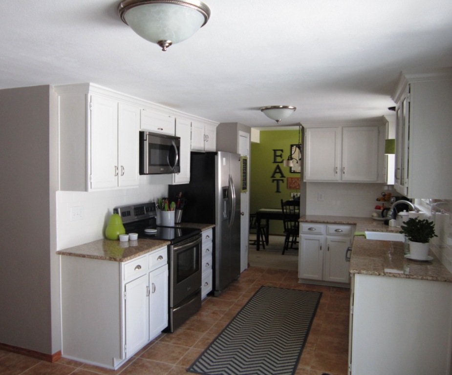
Part Two left off with the new countertops and subway tile backsplash installed. This post shows all the finishing touches that make me really fall in love with the space.


The space is so bright and clean looking now. The runner is from Ballard. It's indoor/outdoor, which is perfect for a kitchen space. We can wipe up spills with water or take it outside to hose off if it were to get that dirty.


That light from Ballard is genius. There was a pot light there. This new light has a pot light adapter for installation that took me 2 minutes. The shades come in different colors. Mom sewed that little valance for me from an extra curatin I bought from Z Gallerie to match the sliding door. 
 

The green accents in the kitchen really play off the green walls in the adjacent dining room.


We swapped out the fridge the previous owner had just purchased. Lowe's basically took that fridge back and gave us full credit, which we applied to this counter-depth side by side. I felt it was important that the fridge not stick out into the space (which was already a bit narrow).


We moved the table off to the side for easy access to the back door.


All the little touches are what make me so happy. This pear lived in my grandmother's kitchen and was filled with sugar. I never met her, but I think I got some of her cooking/baking genes.


The pulls on the drawers took a lot of mental effort (long story). So happy with how they turned out.


I like having something "alive" in most of our rooms. This little "money tree" plant came from IKEA. The cool glass milk bottle came from TJ Maxx Home Goods.


I think I mentioned this in the last post, but we had the wood taken out of these upper cabinet doors and I picked a seeded glass insert. We keep all our white dishes, servings bowls and special "good luck" mason jar (used at our wedding) in here.  


A view of the entire room as we live with it daily. What a happy space!
 

And because you know I love side by side comparisions, here you go.

This room took priority when we first moved in. I spend so much time in the kitchen between cooking dinner nearly every night (yes I really do that) and making special treats. We also love to entertain and people ALWAYS congregate in the kitchen. I wanted the space to reflect us: inviting, comforting, bright, cheerful. I think it accomplishes that. So we consider it finished...for now. 

~Karli  

Friday, February 22, 2013

Karli's Kitchen Makeover: Part Two

Here's part two of my kitchen update. I thought the last post showed a drastic change, but this one is a very close second. 

So we left off with white paint on the cabinets. It was already such a happier, brighter place to cook. I spend so much of my time in the kitchen, I really wanted to love this space (but not break the bank in the process.)

Just a reminder of where we left off after painting the cabinets.
At this point we didn't have a backsplash on the wall behind the stove--probably the place where I make the biggest mess (hello spaghetti sauce and cake batter splatter).
Painted cabinets, but we were still living with old counters and one missing next to the fridge--a result of my super measuring skills.
At this point, we hired a contractor for new countertops, backsplash and installation of a new sink and faucet. I knew I wanted a fairly neutral slab that would work with stainless appliances, white cabinets, gray walls and the future darker hardwood floors we'll have (these might be in the plan for 2013--fingers crossed). So off to the granite yard we went... 
Brent was holding up a white cabinet door and a darker clipboard to represent the future hardwood floors. We wanted to check out how the slabs looked with those components.

At this point I'd also decided I wanted to do a classic white subway tile backsplash. For many of the same reasons I chose white cabinets, we chose a crisp white backsplash and white grout. My goal was to bring light to the space!

At the same time, I ordered my dream sink and faucet. I HATE (cannot stress this enough) trying to wash large pans in a double sink. So my answer was one giant sink basin in classic white cast-iron. Nearly every day I say to Brent while washing dishes, "I will never regret spending the extra money on this sink. Look at me...I can run this entire cookie sheet under the water!"

After the counters had been templated, cut and were ready for installation, the crew came and took out the old, ugly stuff. I did a happy dance! 

Old counters GONE!
They made fast work of getting the countertops installed and putting my new sink in. That faucet is pretty awesome too. The spray nozzle can toggle on and off and just slides right out of the neck.
This makes me so happy!
The next day the tile guys showed up and started the subway tile backsplash. It was tedious work and they had to make several trips to the house: mortar dry time, grout and finally a seal on the whole thing. 
 
Woohoo! What a difference with the counters, backsplash and white sink too! At this point we still needed the grout/seal and electrical covers.

 
Just look at how much brighter it is. I love the way the light bounces off the subway tiles.

I think I may have forgotten to mention in this whole process--that ugly light over the former owner's dining table was one of the first things to go. Before we had our table there, I can't tell you how many people nearly ran into it.  

I'm working on a final post so you can see the real finished kitchen. (Maybe soon I can post more with the wood floors too).

~Karli