Showing posts with label fabric. Show all posts

Sunday, September 15, 2013

The McOlson House: Design Boards

Yesterday was a fun day! Karli delivered Marie and Travis the design boards we put together for their main living areas. This included the front room/dining room, the kitchen space and the family room. Below you can see each room's design board with notes for the two fo them as they start to execute the plan.

While Karli was there, the placement of the furniture in the front room was adjusted and Marie sent me a message today saying that she's going to buy the paint right now.

Here's the front room design. The walls will be SW Accessible Beige and the ceilings will be white.

Marie's front room


A view of the room
 
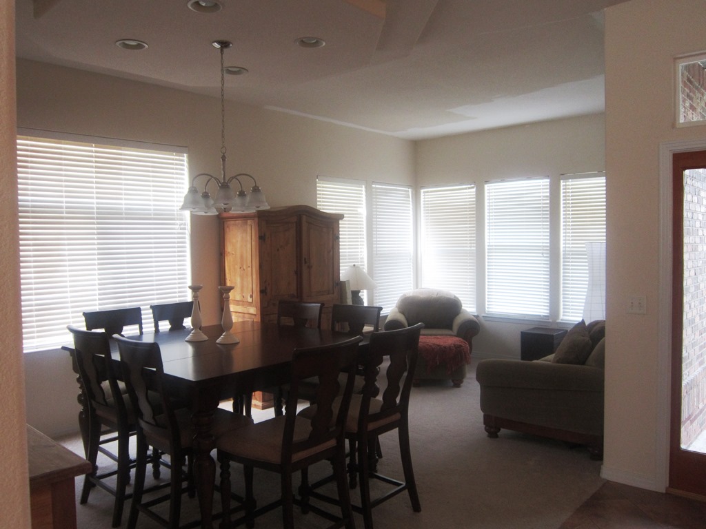
The front room and dining room are open to one another, so they all need to be the same paint color. We also wanted to repeat the mustard/yellow accent by painting their side board and then hang that "inspiration piece" above. You will see that piece right as you walk in the house, so all the accent colors have been chosen to play off that.

The dining room view
 
 
Marie's Dining Room


Next up is the kitchen. They shared the floors they've chosen for the entry, kitchen and family room and we must have guessed correctly, because something very similar is represented below. We talked about painting their island SW Tricorn Black as shown below. Then potentially dropping three pendants. The eat-in kitchen will get a new light too. This whole space and the adjacent family room will be SW Functional Gray.

Kitchen view

Marie's kitchen


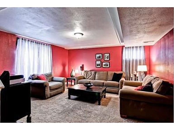
And finally, the room that presented the more challenging aspects of the entire project. The room is large and expansive. It also has a large wall that is calling for some art. The location of the TV required some creative thinking.
Family room view


So we've proposed two large square canvases hung vertically above the black console to draw the eye up. We also suggested adding a small bookcase under the TV, near to the stair railing to "ground" the TV. It should be painted the same color as the walls for balance.

We left lots of options for patterened curtains and rugs. We wanted them to be able to choose their favorite within their budget and timeframe. Their existing furniture will work in the room (rearraged ever so slightly) with potential additions of a chair (in an accent color like teal) and some transitional seating like poufs or cubes.

We also suggested that they paint the inset where the clock hangs over the fireplace a green. It will balance the two green canvases hung on the adjacent wall.  

Marie's family room


We really enjoyed putting these boards together and can't wait to see how it all comes together.

Kandy and Karli

Sunday, August 25, 2013

Master Bedroom Progress (Part 3)

Since my Master Bedroom Makeover is taking so long, I decided to keep you abreast of my progress.  I posted about loving the paint color, see here.  Well the paint is all complete now and I still love it.  I used Valspar in a Flat Finish.  The color is Skyscraper Taupe. 

I'm showing you this glimpse of the bed area.                                     


The mirror over the bed is antique and had belonged to my parents.
I realize some decorators would nix putting a mirror over the bed area but rules are made to be broken!  I am really liking the white bedding, white lampshades, and the touches of brass with the gray paint.  Even the gold pillows give a great contrast.  I think some people think you should use nickel or chrome with gray, but I beg to differ.
Karli has found me what she described as the perfect pillow to put in front of the gold ones.  I haven't gotten it yet but can hardly wait to see what she bought me.  I'm waiting to see it before picking out fabric to make a bedskirt and recover the chair seat.  I also want to purchase new white drapes, but I hate ordering online.  I want panels just like Karli found at Ikea, so I'll wait till we take a trip to Denver.

Maybe all of the above reasons tell why my Makeover is not finished yet.  But, I'm taking my time and enjoying every minute of it.

Still decorating,
Kandy

Tuesday, July 9, 2013

One Shirt, Five Ways: My Favorite StitchFix Top

In a previous post I mentioned how much I love StitchFix--an online retailer who assigns me a stylist to shop for fun a unique clothing. In my very first "fix" I received a shirt I never would have thought would look good on me. They proved me wrong.
It is a slightly sheer fabric, so I have to wear a cami underneath. And you're not seeing things, it is cut shorter in the front and longer in the back.
 
Not only did they prove me wrong, but this shirt has become one of my very favorite pieces of clothing. It's full of colors that are easy to mix with, it's comfy, it has great details and the cut is so versatile!

 Up-close so you can see the colors, light material and detail at the neckline.

I decided it would be fun to do a few posts about how I change up the items in my closet and get lots of good out of them--especially with something as trendy as this top. If you're going to buy something that's "hot" one season, you'll want to make sure you get your money's worth. (It may be "not" next season!) 


Style #1: Business Casual Office Wear
I've actually worn this outfit to the office a few times and to a meeting. It's comfortable, yet stylish while looking professional. I simply throw on my black leggings, a black cami, then the top, a bright orange cardigan and my go-to reddish orange ballet flats. I kept the jewelry simple, so just some woven black earrings.
Daytime office wear

Style #2: Casual Friday
I also like to wear the shirt on the outside of skinny jeans. Since the top is long and loose, I feel like I need to keep the bottoms rather slender. I paired this with my "I can't believe I just found this on sale" leather jacket, brown riding boots, a tomato red textured scarf and some large silver earrings.
I like that this could transition to a Friday casual date night too

Style #3: Saturday in the Park (I think it was the 4th of July)--sorry couldn't resist finishing the lyric
In this case, I tucked the shirt in and bloused it out a bit with my black Bermuda shorts. I added some sandals and lots of silver jewelry.

A skinny colorful belt might be nice here too, but since I bloused the shirt, I didn't feel like it needed one.

Style #4: Dressy Date Night
I feel really put together when I wear something like this. Since we aren't really "dressy" people I think I've only worn this once. But it's still a good look! I tucked the shirt in smooth--not a lot of blousing this time--with a slim fit black skirt. I added a tan belt and tan wedge sandals. Since I wore a blue cami underneath, I punched up the color with bright blue woven earrings and an orange bangle.
My "I've got it all together" look

Style #5: Sunday Brunch
While we're being colorful, we may as well embrace it. In this case, I paired the shirt with my tomato red denim skinny cropped pants and kept the shirt on the outside since they're skinnies. To add another color to the mix, I wore my turquoise ballet flats and lots of turquoise jewelry.
Embrace the colors!
You might not have even noticed, but I didn't do any necklaces with this shirt. I'm sure you could, but I wanted to let the fun neckline speak for itself, so I just stuck with larger, statement earrings instead. With my short hair, I also think the earrings keep it looking feminine.

I hope you enjoyed this post. It was really fun to put together. I'm already scheming a few more soon (maybe my mustard yellow cropped pants--who knew those could be so versatile?)!

Karli

Monday, June 24, 2013

Hotel Sax Chicago: Design Inspirations

This week I traveled to Chicago for a recipe photoshoot with work. I decided to stay at a different hotel in River North. I found Hotel Sax online and was impressed with the location, rate and reviews. So off I went.

It is located right next to House of Blues off State Street and Kinzie within walking distance to lots of great Chicago steakhouses like Harry Carey's as well as some hip new resaurants like RMP and Sable Kitchen + Bar. (I ate at the last two. Did not disappoint!)

The reception area was the first unique element I noticed. The antique glass display cases were filled with cut crystal glassware. It was not the normal sterile greeting!

 
The halls on the way to my room featured graphic pewter carpet, metallic tone-on-tone wallpaper and dark wood trim. A sort of rock 'n roll vibe...
Loving the patterns, metallics and darker tones.
And so the wallpaper continues...

In my room I was greeted with a variety of textures, patterns and tones. A snake skin chair, an embossed leather headboard, plush black and white carpet, crisp white linens and wood grain furniture. (All of this with a lack of "artwork." I love how this design lets the colors and textures be the focal points instead of a large picture over the bed, for instance.)
LOVE that wallpaper. Very subtle but gives some interest to the wall.
An up-close of the wallpaper in the bedroom


This cool sidetable has a glass top with purple marbles inside. I also love the mirror behind the side lamp. Again, it doubles the amount of light and makes the space feel big.

In the bathroom, the lime green grasscloth wallpaper really set off the black and white tile and fixtures. 
Modern with a nod to retro


I love that this wallpaper makes you want to touch it!
After using the bedroom and bathroom for a few days I think there are a few things I want to tuck away in my own "inspirations" for our future master bathroom remodel and a couple updates in our master...

Larger white subway tiles.
Again, a modern bit of retro.

Black and white floors (I love these but I think I might get tired of them in real life)
So much fun
These were actaully small tiles laid in a square 4x4 pattern

I love their tasteful use of mirrors (because we all know there is a fine line between 70's creepy floor-to-ceiling mirrors and framed modern mirror features)...
This is opposite the large windows so it bounces light around and makes the room feel much bigger than it is.
Our master bedroom is big enough to have a small seating area. I love the idea of one soft chair and lamp.
Notice that this lamp base is painted a dark purple.

So if you can't already tell, I'd recommend this place if you're headed to Chicago and you like a posh, modern, rock 'n roll style.

Feeling inspired,
Karli

Saturday, April 13, 2013

My Stylish Wardrobe Staples

The items I consider staples in my wardrobe might be a little different than some of you, but it struck me today how important these items are. I recently wore out my favorite shoes, found a hole in my black tank top and realized just how many things a good blazer goes with.

So here's a round up of the items I find myself wearing over and over again to create my sense of style.

1. Leopard flats
Now I know you may be thinking "Really, Karli? This is your number one item?" Yes, yes it is. I'm on my third pair if that tells you how often I wear leopard shoes. I find them very versatile, almost a neutral, and they give my outfits just the right amount of "funky." 
Product Image
I found these at Nordstrom Rack on sale! Hooray!

2. Colored tanks
I wear tank tops under lots of things...including my #3 item. Under cardigans, under deep v-neck shirts, or alone...these things are easy and versatile!
 
I usually get a variety of colors from Target.

3. Stretchy one or two button blazers
The reason I specify "stretchy" is because I find that I don't feel as restricted if the material is a softer, less stiff, fabric. I wear blazers with jeans and dress slacks. I wear them with skirts and I also put them on over dresses that might be too bare for work. I have so many colors, but I get the most use out of black, teal, gray jersey and gray pinstripe.
 
My friend Angie turned me on to Olivia Moon blazers from Nordstrom. I love the rouched sleeves--since I always want to push long sleeves up, these work perfect for me.
 4. Scarves
I would be embarrassed if I actually counted the number of scarves I own. I find that I can wear something rather plain, like a black dress, and easily switch it up with a scarf. Given that I look best in brighter jewel tones, the ones I wear the most are green, purple and orange/coral. Mom got me a great leopard scarf that I've worn a lot too (but not with my leopard flats---that's too matchy for me).

I don't own this scarf, but man I love it!
 5. Jeans
I love jeans. I wish I could wear them to work every day. I love that you can easily dress them up or down. I feel like I really could get by with just two pairs. One needs to be a dark wash, bootcut, long enough to wear with, well boots. The other pair needs to be a skinny jean to wear with flats, sandals or tucked into tall boots with a looser top. Easy.


My favorite bootcut jeans are from Lucky and Seven.

I also have Lucky skinny jeans
I just realized that the little shopping trip I had to the discount store today is helping me acheive my style resolutions for the year. How cool?!

What are the staples in your wardrobe?

~Karli

Thursday, March 7, 2013

Kandy's Master Bedroom Makeover, Part I

It is time to makeover our bedroom. It's looking tired, old, and a little heavy. (I could be describing more than just our bedroom!) Anyway, it is past time for a new look. I usually change things up about every 10 years or so. 

But, before I share the plan for changes, I thought you might get a chuckle out of where this room has been over the last 30 years.

In the 1980's it began as pure "Country."

Check out the waterbed
 
Check out the goose wallpaper border...if you couldn't sleep you could count geese.
In the 1990's, still Country, with more ruffles and Victorian touches. The walls had been painted hunter green. The accessories were burgundy and navy...believe me that was the "thing" back then. We had purchased a new oak bed and I had refinished the chest of drawers.

White bedding in the summer.

Navy bedding for winter....the ruffled shams and bedskirt remained the same.
 
The oak armoire is still in the room, just accessorized differently.

In 2000, the room got painted an olive green. I made the window valances, that in itself could be a new post. We also got a new comforter set and I made coordinating pillows.

The room in shades of green and khaki with a more monochomatic feel. (This must have been taken during the holiday season)
Then I had to make even more changes, the valances got recovered in a different fabric and I added fringe and changed out the bed pillows.


The brass lamps are antiques.This oak chest is a more recent refinishing project.
 
The valances


Probably need a new look here now. 

So, on to the plan for changes:
  • Repaint doors, trim and window trim white. 
  • Repaint ceiling and wood trim white.
  • Repaint walls a shade of gray.       (pick the perfect shade)
  • Purchase new white drum lampshades.     (probably at Target)
  • Purchase or make a white lumbar pillow for bed.  (to go in front of gold ones)
  • Purchase or make new art for over bed.
  • Recover oak chair seat in a gray pattern fabric.
  • Recover window valances, or uncover older fabric, or remove altogether???
I'm challenging myself to make these changes with very little money. Therefore, I'm keeping our old bedspread and all the furniture. I also need to change out some accessories...give the room a crisper, lighter, more modern touch.  

Anyway, I'm excited! When you live in the same house over 30 years, you have to keep changing it up or it gets as tired looking as its owner.

I'll keep you updated with the changes and transformation.
(See an update here)

~Kandy

Thursday, February 28, 2013

Guest Room Curtains...A Goldilocks Tale

I hinted about this post when I shared the fabric "headboard" in my guest room. So here's how we reused some curtains from the basement in my old house in the guest room and made them just the right length (not too short and not too long, hence the Goldilocks reference)...

Here's a pic of the curtains in the basement of the old house.
It's a little hard to tell here, but they are black and white stripes.
The panels were 84 inches, which was perfect in the old house. In the new house 84's are too short but 96 inch panels are too long. But there wasn't enough in the hem to just let it out. What to do?

Answer: The answer in this case was just adding some length to the old black and white striped curtains. We found a fabric that coordinated with the fabric we used as the headboard and added it to the bottom. Now you can start to see how orange is becoming the predominate color in the room too.

This fabric allowed me to get a pop of color on the window treatments. And it saved money--always a good thing!

Here you can see how they look in the room.

Mom kindly sewed the fabric onto the curtains while Brent and I installed the ceiling fan (I'm re-living how hot it was in this room before that fan!). She also used a little bit of leftover fabric to make a pillow for the bed. (I feel like I've talked about her sewing a lot in this blog. I need to learn to sew!)

I like that the pattern is repeated in two places.

And now does my hint from last week make more sense? :)

I couldn't help sharing this pic too. I love this collection of mirrors on the wall opposite the bed.
 I'm still contemplating the paint in this room. I also want to update the lamps--the two in here now were both hand-me-downs and while they serve their purpose, I want something a little more ecclectic.

~Karli

Sunday, February 24, 2013

Not Your Average Fabric Headboard

When it came time to furnish our guest room, I knew I wanted something different and unique. As far as I'm concerned, the guest room is a great place to be a little bit bold while creating a comfortable environment for overnight visitors.

In our old house I had a headboard that resembled an old metal gate. (Very clever, but it banged the wall--not conducive to a good night's sleep.)

In the new house I was starting with a blank slate (you can see it all here). Here's the previous owner's version... 

Oh boy, this takes me back. Look at those curtains.
Mom was visiting one weekend and we decided to go visit the brand new IKEA and there I found my jumping off point in the fabric department. (If you haven't already heard me say this, I'll say it again. If you're starting with a blank slate, I find it helpful to search for just ONE thing that you absolutely love. Then just design the rest of the room around that.) 

Two yards of fabric later (and some hemming that Mom did for me) along with a previously used wood curtain rod and some screws and nails...we had this:

I love how bold and graphic this "piece" is in the room. It is the focal point and provided the inspriation for the other furniture and fabric choices in the room. I think the fact that we hung it very near the ceiling gives the room height.

Here you can see that we simply used a wood curtain rod.

In this pic, I wanted you to see that we ran the "headboard" about half way down the mattress. We also tacked it to the wall with small nails. I didn't want the fabric to get caught up in a pillow toss in the middle of the night. It stays put, just
as we hoped.
 So my next "to-do" for this room is paint. I'm yearning for something warm and slightly colorful. I'm thinking of a burnt orange accent wall. Maybe it would be too much?? 

Stay tuned next week to learn about how we customized the curtains in this room. I'll give you a hint with this picture.

What does this pic have to do with curtains? Check back next week and I'll show you.
~Karli